
Project Overview
KALAB is an app designed to be your companion, eyes, ears and feet on museum and art gallery visitations, whether you’re at home or visiting our venues. It is an ongoing design exercise as part of the Google UX Design Professional Certificate program.
The issue
With the 2020 pandemic, public social gatherings turned into a risk many couldn’t afford to take. How could we still consume culture with depth without leaving our homes?
The Goal
Building a virtual platform that served as a hub for visitation of multiple venues during the pandemic, also aiding visitors and bringing depth to a museum visit after venues were safe again.
Defining the problem
1. Persona Building (Understanding the user)
From interviewing possible users, I was able to build two personas who could benefit from the app -

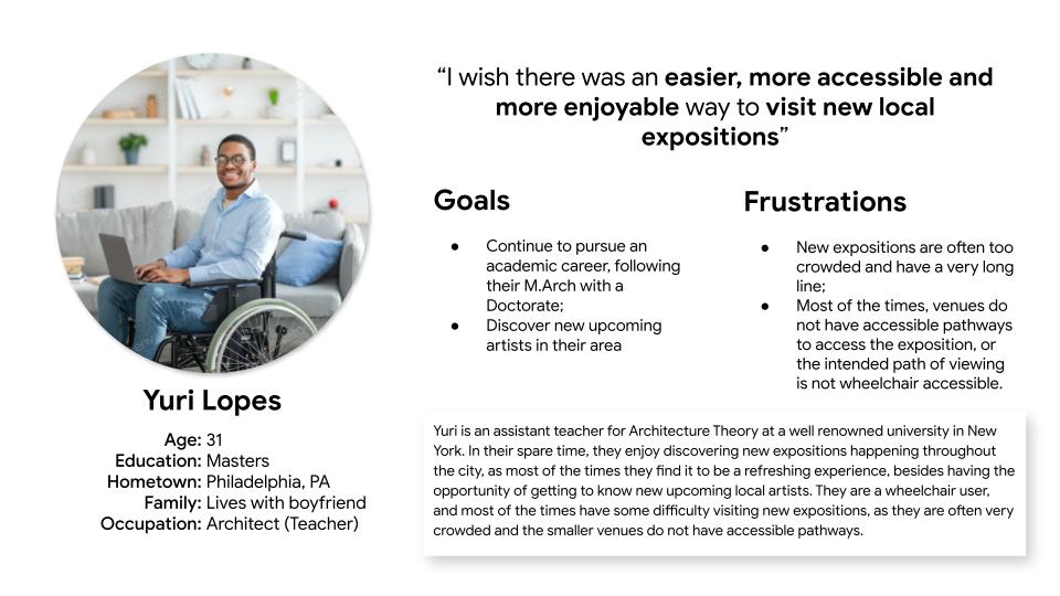
Yuri is an unique user, what inspired me to build a specific user journey for his flow of discovery and use of the app:
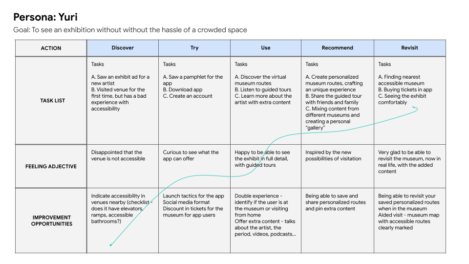
The building of this user journey brought upon the following problem statement:

2. Competitive Analysis
Before starting the designing process, I researched what was available on the market and generated a report of my competitive audit. This app had a few major competitors, citing a few:
Google Arts & Culture (indirect competitor)
Strenghts
- Offering an easy to find full-page translate feature;
- Clean design;
- A diversity of features of interaction with artwork;
- A diversity of partner museums and, as a result, a large collection (including underrepresented cultures).
Weaknessess
- Not making use of the geolocation feature to showcase the exhibits and experiences or nearby venues;
- Heavier features crashing frequently.
Rijksmuseum (direct competitor)
Strenghts
- Discounts for app users on shop and tickets;
- “Choice assistant”, a feature that helps you curate your own personalized exhibit;
- Immersive audio descriptions of artwork;
- Mapped routes for interest points within the museum (toilet, shop, café and exit).
Weaknesses
- Unusual website UI (different from standards, sometimes confusing)
From those results, I understood that my project had to have the following characteristics:
- Light (light features, that could be used on every phone);
- Familiar (targeting a wider variety of users);
- Local (showcasing local venues and exhibits);
- Accessible (be a tool for aiding accessible visitation on venues).
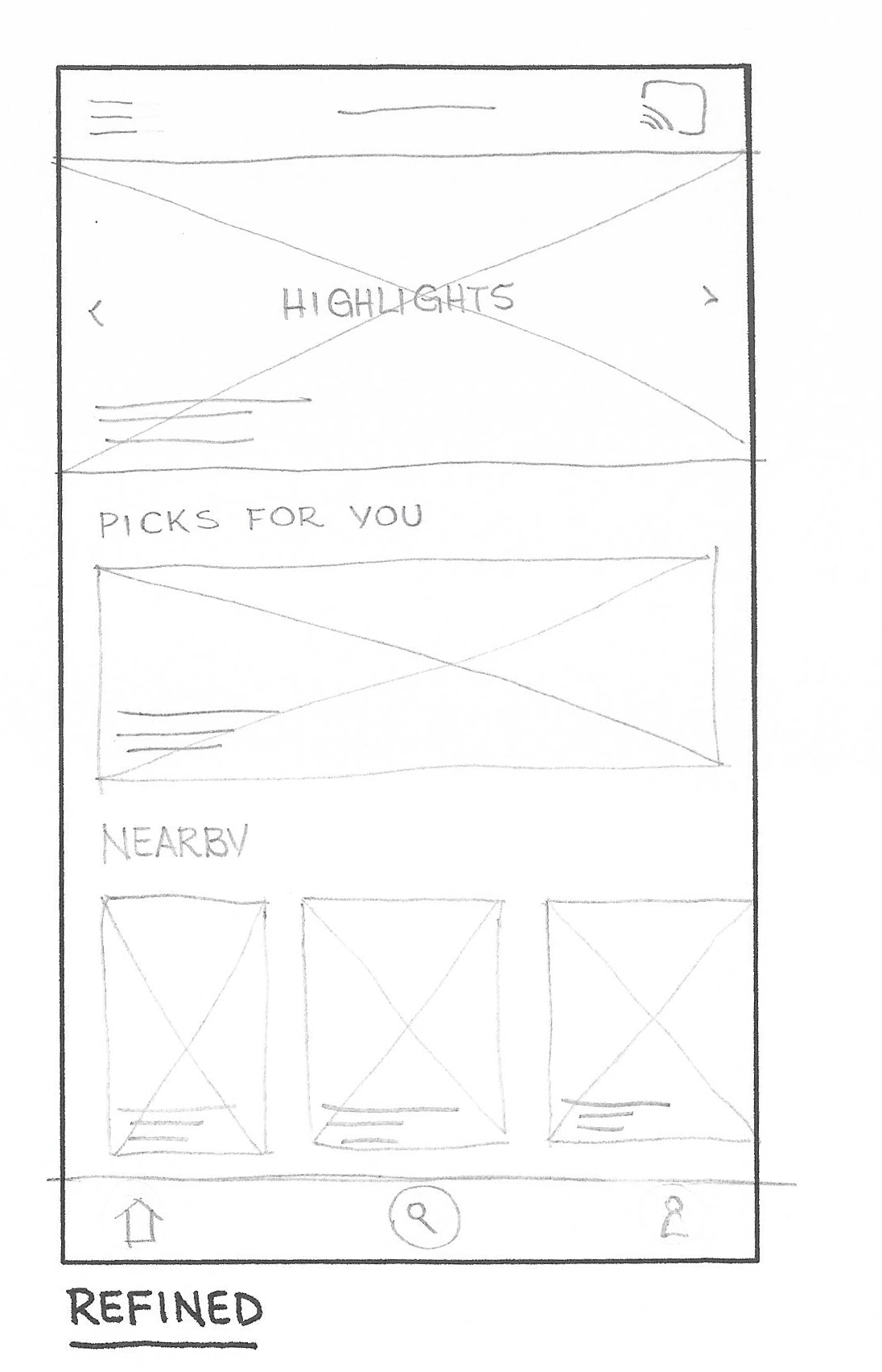
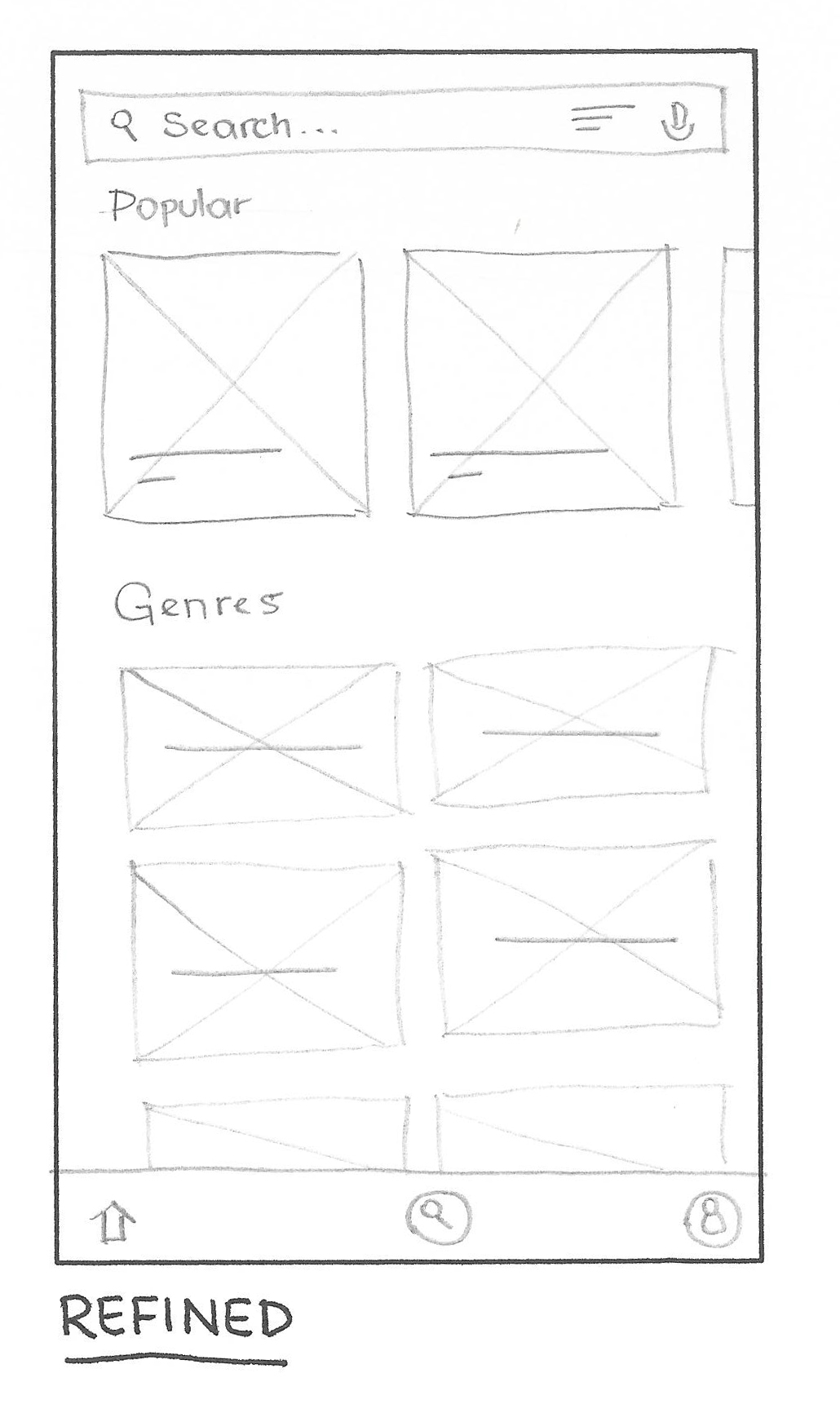
Starting the design process - Wireframing
The wireframing process was guided by these characteristics, and mostly presented a very light UI:
Prototyping (Low Fidelity)
The prototyping phase came with some improvements on the user flow and overall layout, and it was developed using Figma. This is where I currently am at the developing phase of this project.

Next steps
- Starting the usability study;
- Refining the design (high fidelity prototyping, mockups).